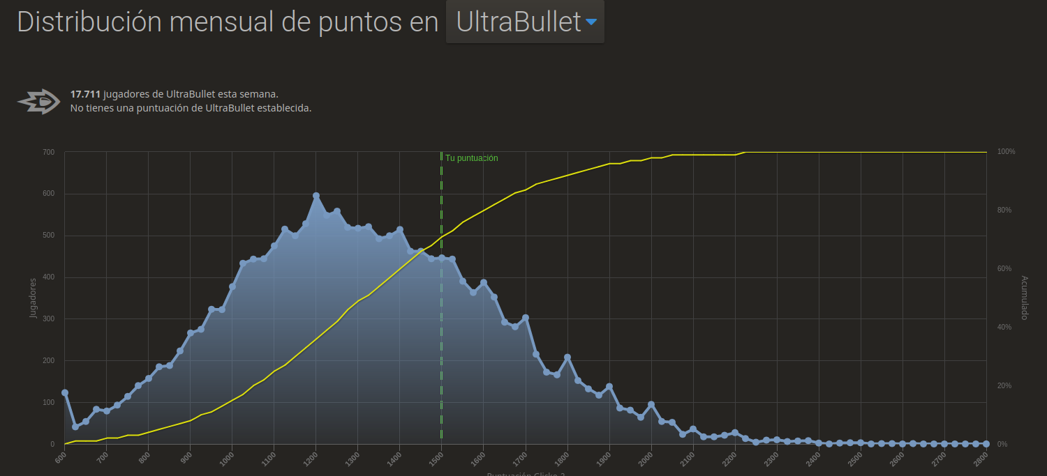
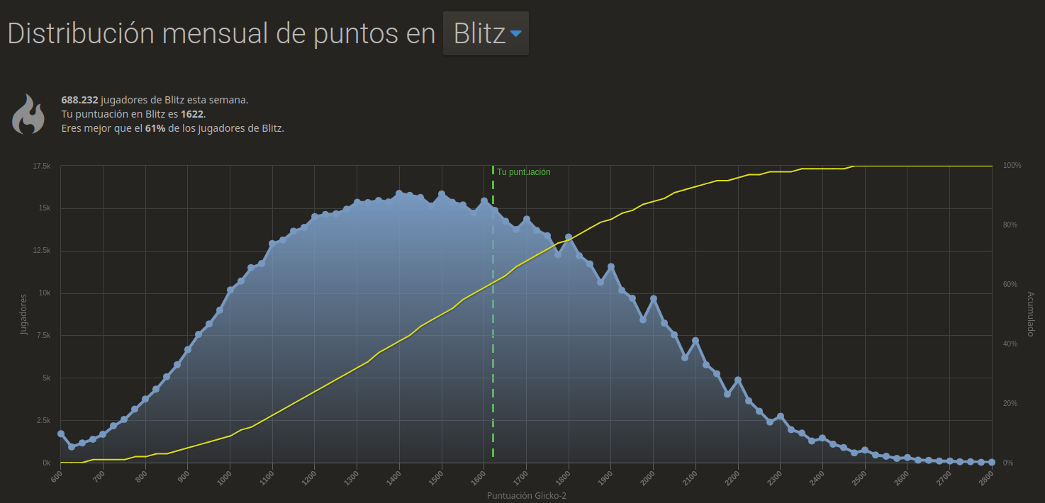
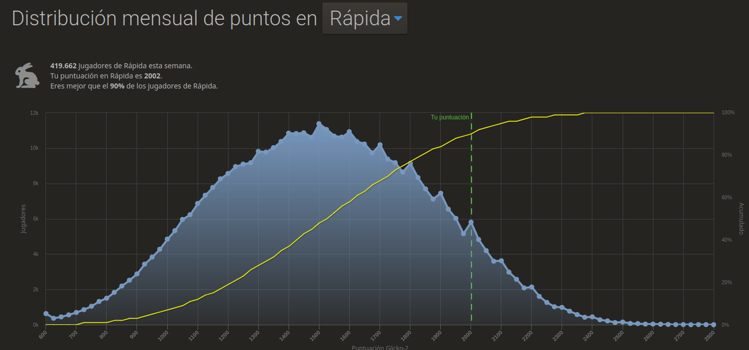
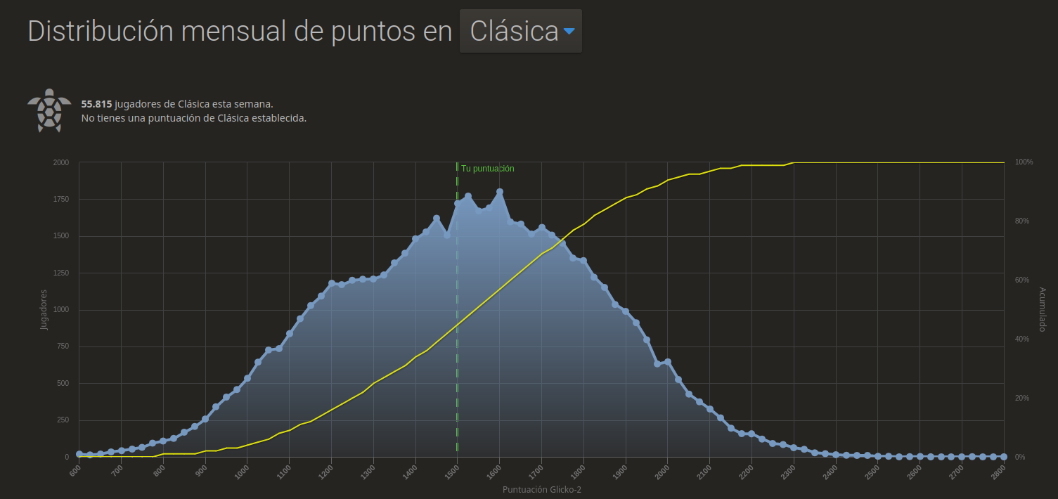
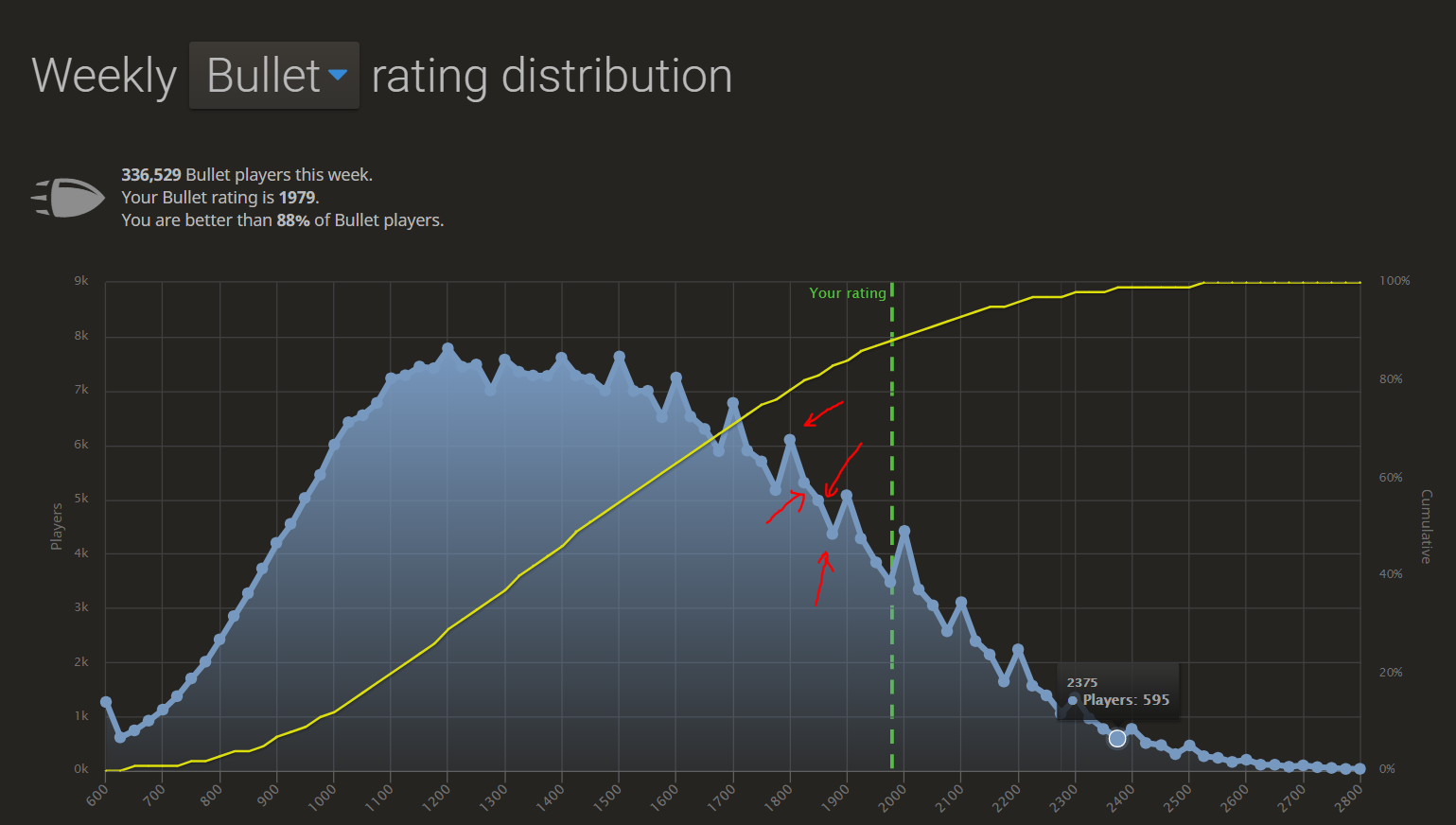
This is because Lichess is plotting the curve, taking 25 rating points as a unit. That's why you can see coordinates on X-axis 25 points apart.

Now, let's understand the concept with an example. Say, Lichess is using Floor(25) to plot the graph. So, If your rating is 1979, it will consider your rating to the multiple of 25 you have just passed (i.e., 1975). Let's say, you have lost a game and your rating has gone down to 1972, then it will consider you in the 1950 tier.
Now the obvious question is Why?
As you can see, this is a frequency plot (Non-cumulative). Now, assume that you take the unit of your plot as 1 (instead of 25). Also assume, the number of the players as follow:
| Rating |
No. of Players |
| 1900 |
37 |
| 1901 |
23 |
| 1902 |
3 |
| 1903 |
7 |
| 1904 |
17 |
| 1905 |
32 |
| 1906 |
33 |
Now, if you plot the above imaginary data, it will be very hard to understand the trend of the rating due to numerous peaks and crests. That's why, a good practice will be to form a normalized group or say a rating range first (Like in this case, 1900-1925) and then plot the graph taking the range as a unit. In this way, you can visualize the data better.
Now, you as well as another person in the comments have already pointed out that people always try to achieve a milestone (i.e., 1500,1600,1700,...) and halts playing for a couple of days to keep their rating in that milestone. That's why You can see the micro peaks tend to happen in the first quarter (i.e., 1500-1525, 1600-1625, 1700-1725, and so on). This milestone mentality is common in amateur players (1600-2100). Absolute novice (<1200) or absolute strong (>2300) players play regularly. That's why micro-peak is not common in those regions.
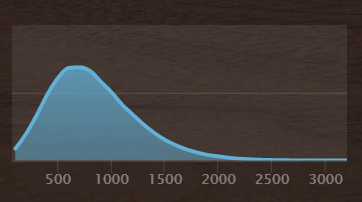
Last but not least, you may ask whether we can make the graph smoother (Something like in chess.com).

The answer is YES. You have to use moving-average for that. But, that doesn't reflect the trend of the mid-tier milestone-mentality. I think that's why lichess sticks to this plot for better insights into the rating distribution.

